Nordic Property Preservation
Logo, mockups
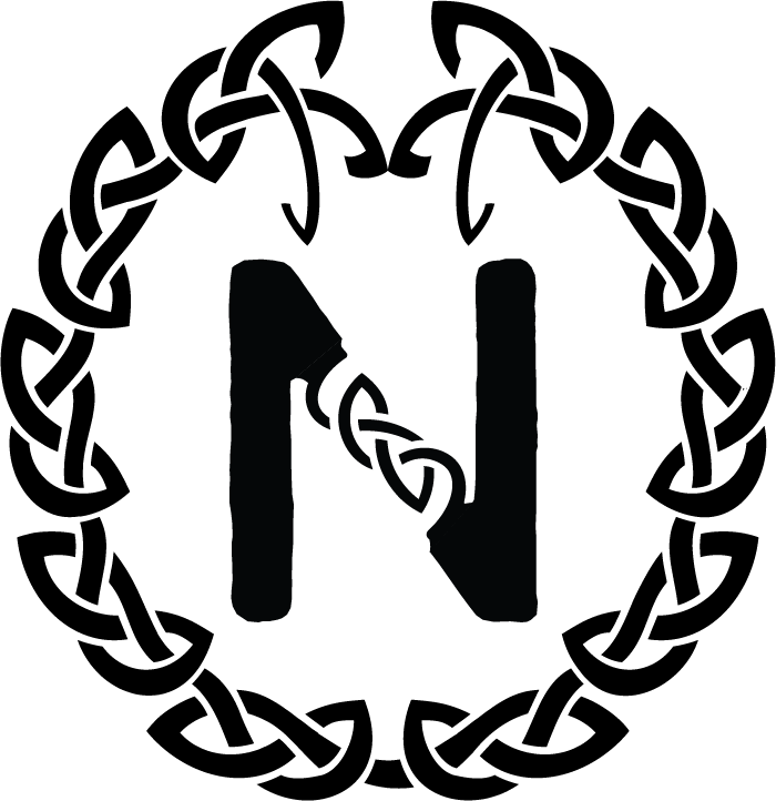
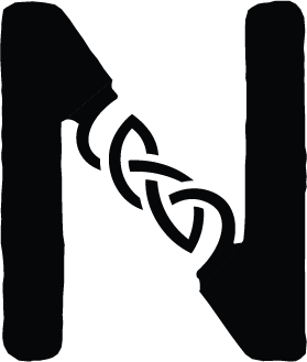
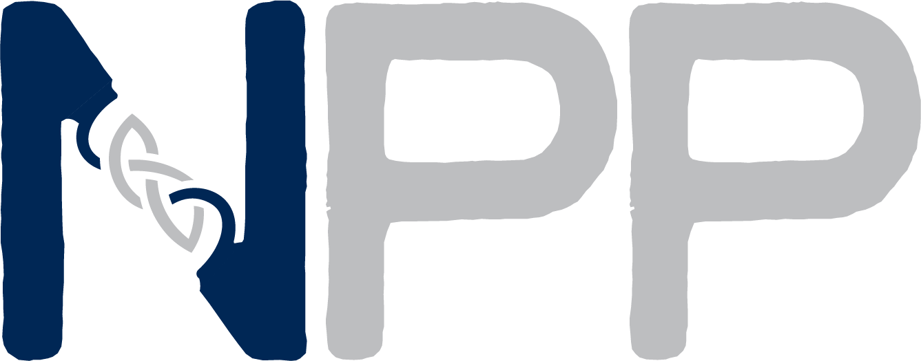
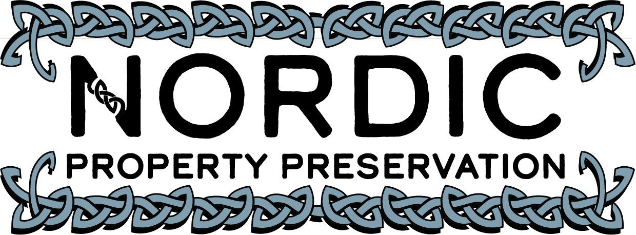
NPP is short for Nordic Property Preservation. This logo design was done for a co-worker that bartended with me for the past year or so. He said he really enjoyed my work and wanted me to design the logo for him and his dad's business. He was deeply influenced by the Nordic knot and wanted something suggestive of that but not at all that. So herein lies the challenge. Nevertheless, I started sketching up a knot that I had seen in a necklace that was sent as an inspiration photo. I took this drawing and sharpened and tweaked it to become more masculine and almost fence-like.
NPP is (yep you guessed it!) A property preservation company takes condemned buildings, lots, and property and secures it from the public. So a construction-esk company to say the least.
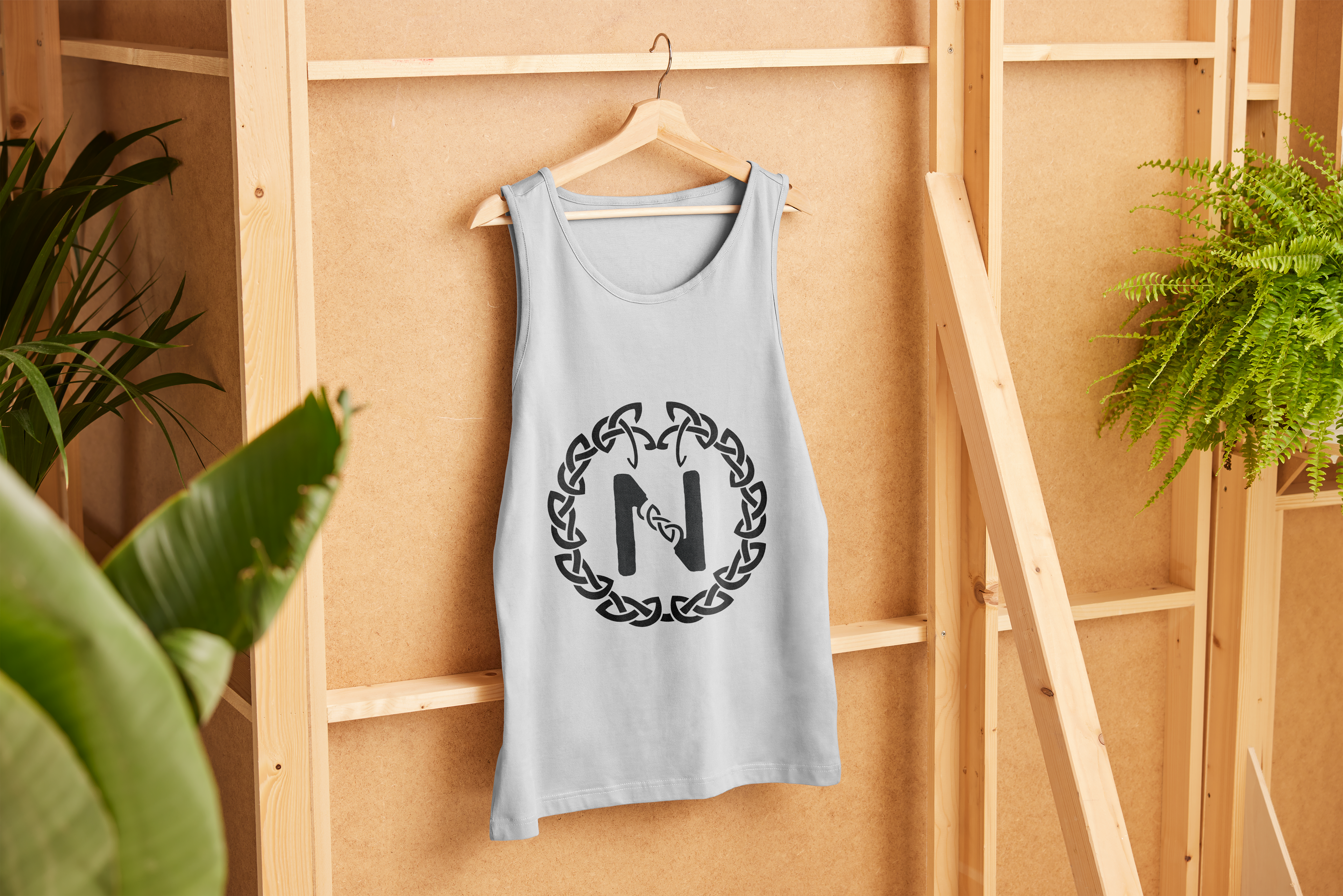
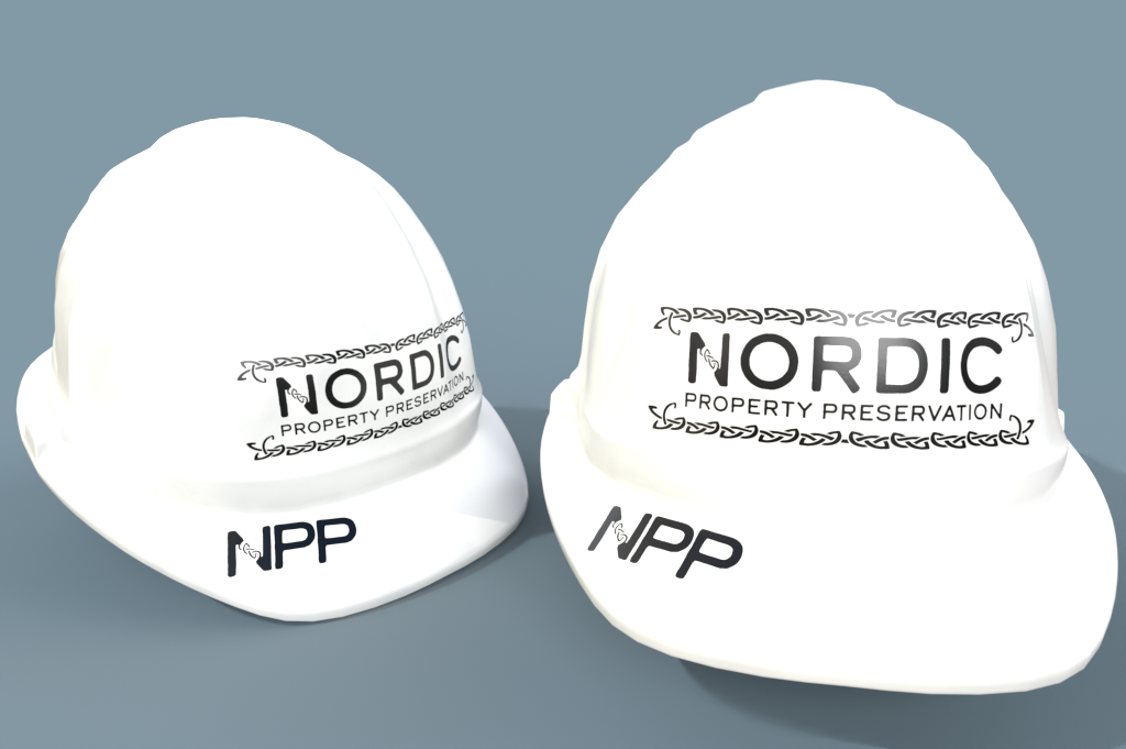
This project was beyond fun to do and really allowed variation within the same design for the client.
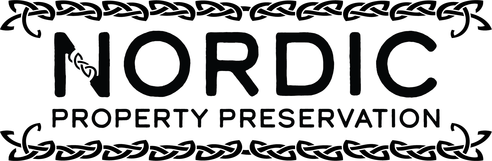
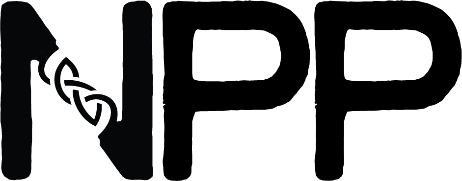
The NPP logo design went a lot like my other works in that a creative brief was done, and initial sketches and research were done to get the brain flowing and in the best direction. Touch-point meetings were held so that I could work with Griffin and his team to create a design that displays the face of their brand. Chose a design layout that fits the vision and is finalized with proofs in-between. sent over web files as well as print files so the client had all they needed to send this off to print, post or online. Mockups are also part of the process for this and many projects.